The year 2017 saw $733.5 million brought into the box office by horror movies alone, with people enjoying a good scare more than ever. People love horror movies, whether it’s an evening in with your friends or the latest movie at the cinema to make you jump out of your seat. The promotion of a horror movie can make it or break it, either appealing to the masses with eye-catching and thrilling posters or selling it as another cliché. When it comes to posters they’re a classic way to sell a movie and modern technology means that they can be more horrifying than ever to draw audiences in.
The Bride of Frankenstein (1935)
Mary Shelley’s story of Frankenstein and his monster has had a massive influence in literature and pop culture, carving the horror genre into what it is today. The Bride of Frankenstein is the original film’s sequel and is considered one of the few movies better than its prequel. The poster features Frankenstein’s monster’s face in the center with the light illuminating him from below, highlighting his sunken eyes and bolted neck. This poster uses darkness and orange, red and yellow, suggesting fire, relating back to the windmill fire in the original film and exclaims, ‘Warning!’ directly above the monster’s head. A variation of this poster, with a similar color scheme, fetched $334,600 in 2007, putting it in the top 10 of most expensive movie posters. This poster is one of the best of its time, with a clear layout, tagline and title.
The Texas Chainsaw Massacre (1974)
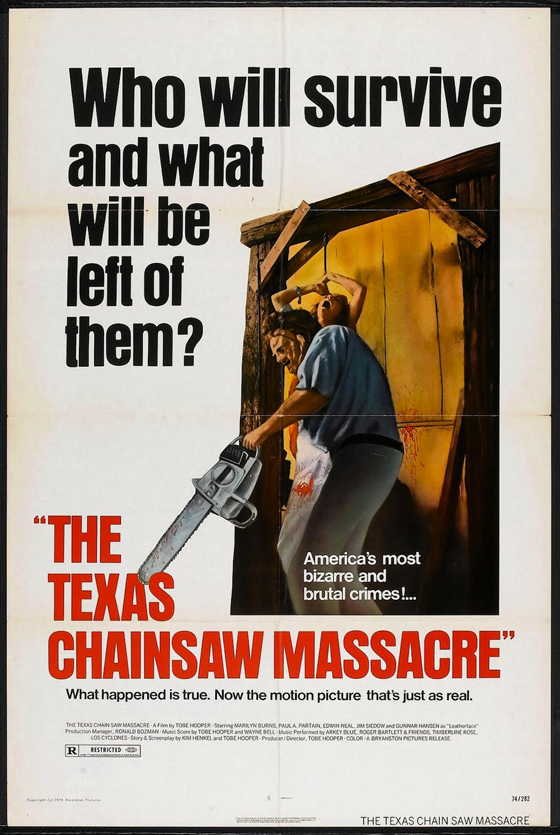
The iconic and violent The Texas Chain Saw Massacre was a low budget film with largely unknown actors that was banned in many countries for being too disturbing. However, it grossed $30 million at the box office and has since been named one of the best and most influential horror films in history. The movie’s poster fits in with the low budget of the film but demonstrates very clearly and effectively what it is about with a man, Leatherface, standing in front of a bloody, tied-up girl holding a chainsaw. The poster uses more words than most, asking ‘Who will survive and what will be left of them?’ and implies that it’s based on a true story, which was credited for a lot of the movie’s initial success. The bright red of the title stands out against the white background and highlights the bloodstain in the background, drawing audiences in. Although this is a simple design, it does the job well, showing what this movie is about, the genre it belongs to and what you should expect.
Alien (1979)
Alien incorporates science fiction into the horror genre and initially received some negative reviews, while others praised it for imagination. It has since become a classic. The movie poster is very straightforward, showing what appears to be a cracked egg surrounded by darkness. A bright, yellow light appears from the crack, sitting above the tagline, “in space no one can hear you scream.” This poster is very atmospheric and sets the scene for audience. It offers few clues, but enough that it intrigues people to want to know more, like what is about to hatch from the egg and why is it so terrifying?
A Nightmare on Elm Street (1984)
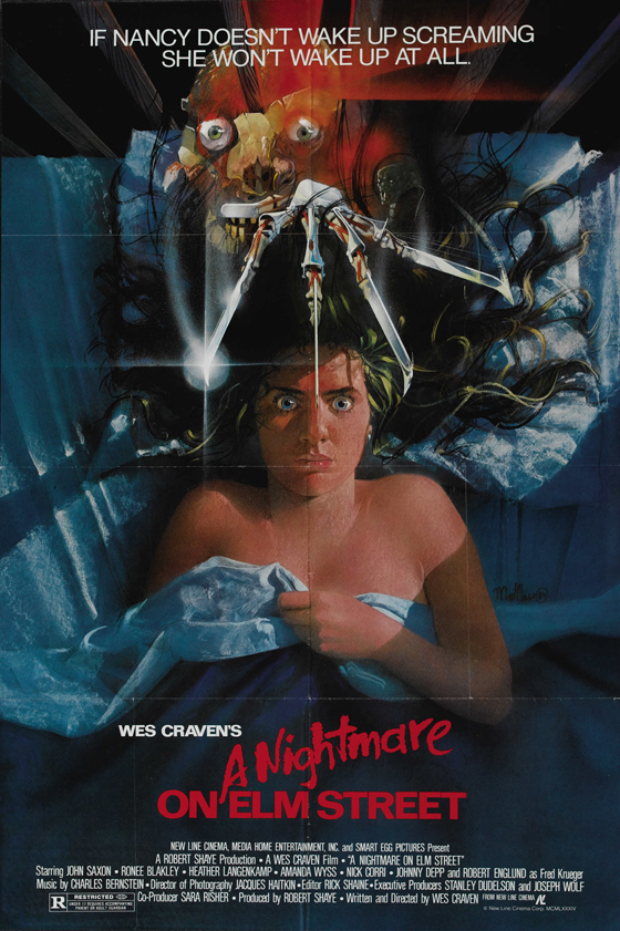
The A Nightmare on Elm Street franchise is the second highest grossing franchise in America and has many effective movie posters that played a role in that success. The film was considered an instant commercial success and earned $25.5 million at the American box office. The movie is about four teenagers who are stalked and killed in their dreams by the iconic Freddy Krueger and its poster illustrates this perfectly as it depicts one of the girls in bed, fearfully gripping the covers as Freddy’s heavily scarred face and razor-sharp fingers linger above her head. The tagline states that there are only two outcomes, which are to “wake up screaming” or not at all, drawing the interest of the audience.
Fright Night (1985)
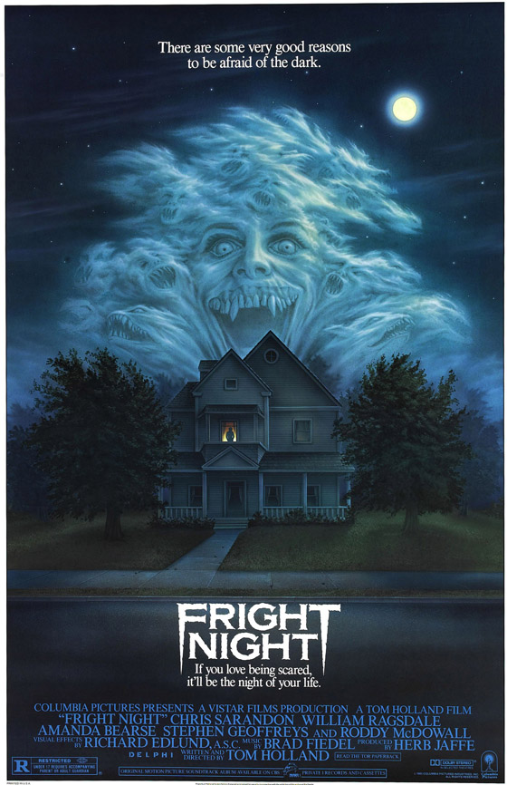
Fright Night has become a cult classic, but it was also successful at its time of release being the second highest grossing horror film of the year. A house sits on what looks like a quiet American dream-like street in this poster, but an exaggerated vampire face is floating out of it, along with many other creatures. One of the house’s windows also features the silhouette of a person with an orange glow in the background. The tagline for this one reads “there are some very good reasons to be afraid of the dark” written in white that almost glows against the dark-blue night sky. The eye is drawn to the vampire mist in the sky which perfectly contrasts with the colors and calmness of the rest of the poster.
The Blair Witch Project (1999)
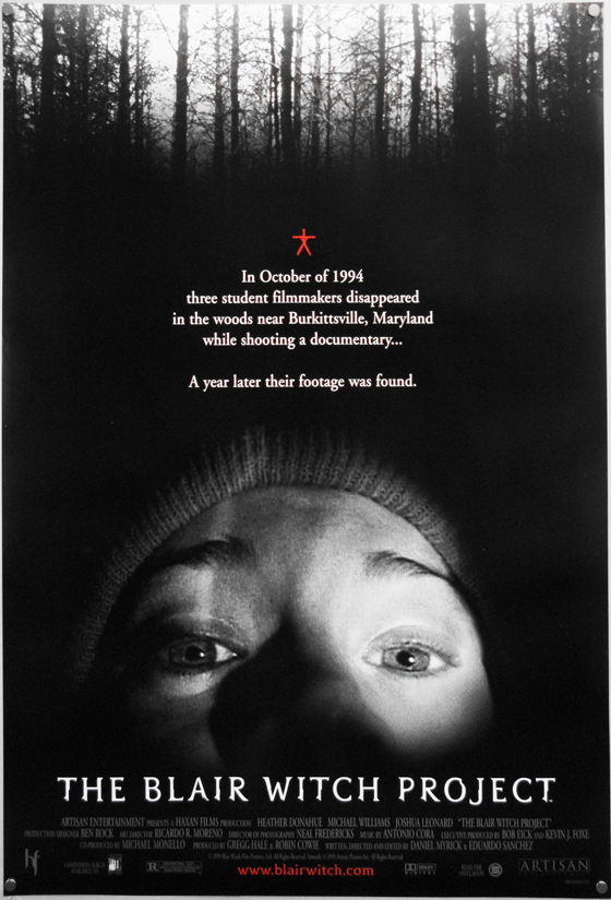
The Blair Witch Project has become one of the biggest independent films of all time and part of its success was down to the style with which it was filmed and its promotion. It’s about three student filmmakers who go into the woods to film the local legend, Blair Witch, but the students go missing and a year later their footage is found. This ‘footage’ becomes the movie. The movie was marketed and believed by many viewers to be real-life footage, which added to its appeal. The movie poster reinforces this idea as it’s a close-up, out of shot face with a bright light coming from a handheld camera. The eyes look scared and upset and the background is a silhouette of the woods, giving the impression of being lost.
Saw (2004)
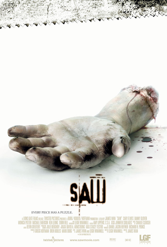
The original Saw movie started with a cult following that set it up for a whole franchise. The whole film was shot in just 18 days on a small budget and became one of the biggest grossing horror movies since Scream. Saw’s movie poster is simple but effective. There are two similar versions, one features an amputated foot and the other an amputated hand. The limbs are dirty, gray and bloody and sit against a white background that appears to be a saw as there is a jagged edge running along the top. This suits the movie perfectly as it’s a simple concept but shows what the movie is about without giving too much away.
Sweeney Todd: The Demon Barber of Fleet Street (2007)
The character of Sweeney Todd first appeared in 1846 and has been revisited many times, most recently in Tim Burton’s 2007 movie. Tim Burton is well-known for eccentric and gothic fantasy films and often plays a creative role in all aspects of his movies, from direction to promotional material. The movie poster features Sweeney Todd by himself looking straight out at the audience with a grimace and a Frankenstein-esque white streak through his jet-black hair. This is set on a blood-red background and splatter going through the movie name. This is easily going to illustrate that it’s a gory movie and the black and red color scheme exaggerates the paleness of the Sweeney’s lifeless skin. If you didn’t know the story of Sweeney Todd this poster will certainly give you a good indication.
Carrie (2013)
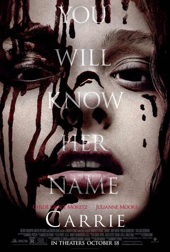
Stephen King is iconic for horror stories, with many of them adapted into movies, Carrie being adapted twice. The movie poster for the 2013 version could not be missed. A close up of Carrie’s face with deep-red blood dripping down her skin on one side contrasts with her pale skin on the other side, where just a few droplets sit under her eye. Her eyes are black and emotionless and stare nonchalantly through the viewer. The tagline, ‘You Will Know Her Name’ is written in transparent white followed by the opaque name ‘Carrie.’ Although the movie received some criticism from fans for cutting a lot of the original story, the poster was effective at earning the movie almost $85 million worldwide.
The Purge (2013)
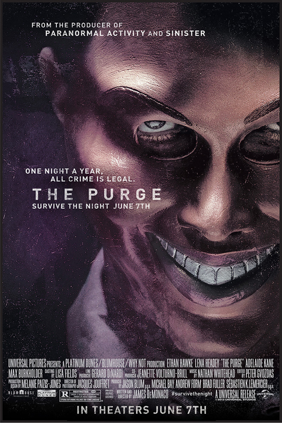
The Purge steps outside of the box and offers an original storyline, giving it the scope to evolve into the franchise it is today. This was another low budget movie that tells the story of crime becoming legal for one night every year. The result was that it became the lowest budget movie to reach the box office since 1988. The movie poster is a caricature-style mask hiding someone’s face where the human eyes are almost lost in it, just like the people get lost in the crimes of the night. An over-the-top, sinister smile is on the mask and sits behind the tagline, “survive the night,” showing the contrast between the people committing the crimes and those running from them.
A great movie poster is based on an image that can be considered art and will still be iconic and recognizable in years to come. It needs to portray the genre and the title should be obvious. Unfortunately, a lot of horror movies and their posters fail here as they fall into the cliché of pouring blood everywhere and use little artistic skill when doing so, but there is a fine line. Audiences don’t want to see the same idea recycled, but they want to know what the movie is about, which means that some conventions need to be followed to demonstrate this. Ultimately, a great horror movie poster goes hand-in-and with a great horror movie.
2 thoughts on “10 Horror Movies and The Posters That Made Them A Success”
Comments are closed.









Jenny,
Thank you for the enjoyable article. You might check out 2017’s The Art of Horror Movies edited by Stephen Jones. It is overflowing with fantastic poster art from the silent era up to today.
Rich Dishman